
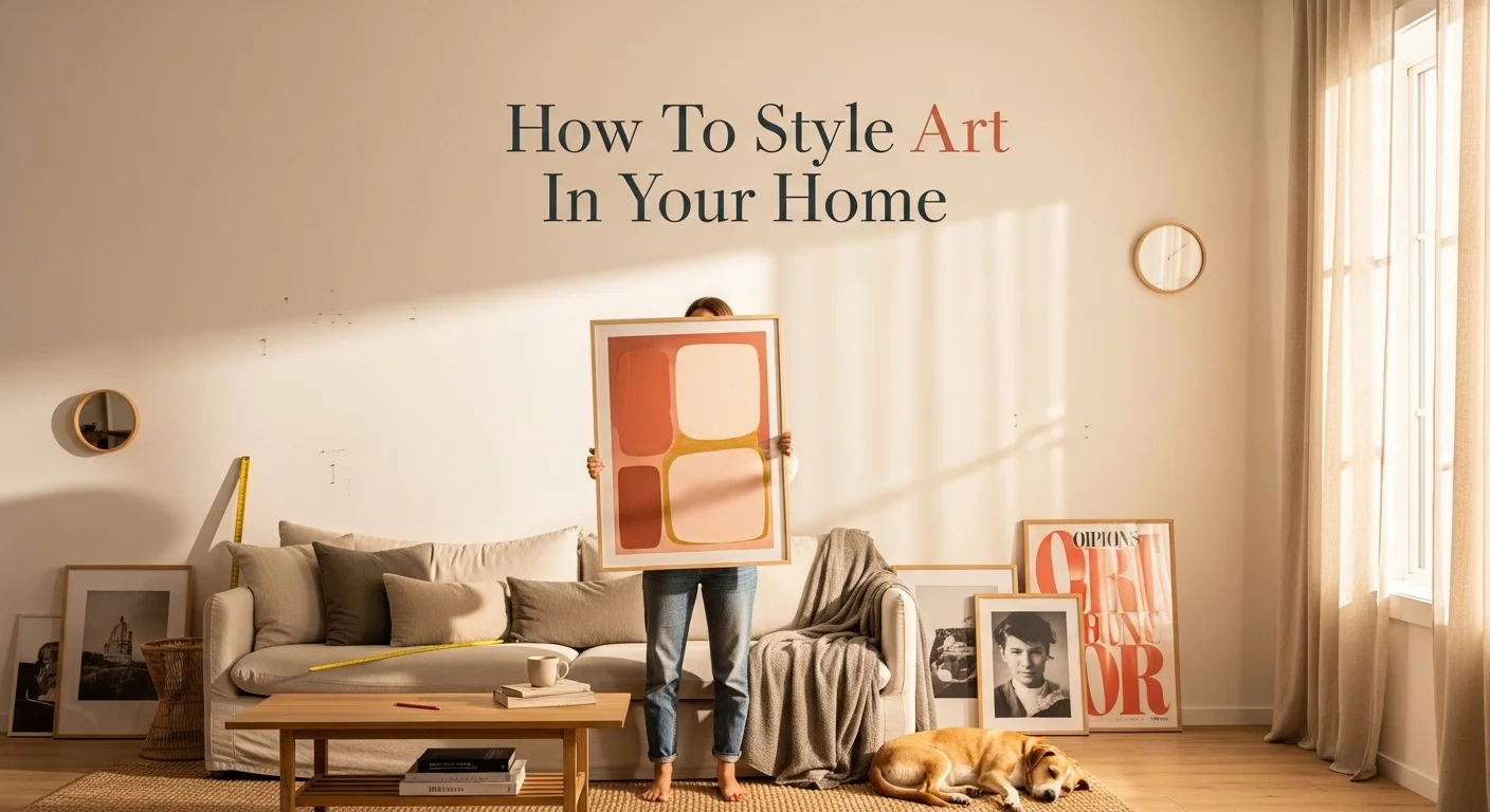
There’s a particular kind of paralysis that hits people when they’re standing in a furniture store, art gallery, or even just scrolling through prints online. You find something you love genuinely love and then immediately start second-guessing yourself. Is it too big? Too colorful? Will it look weird above my couch? Most people end up buying nothing, or they play it so safe they end up with something forgettable that blends into the wall like beige wallpaper.
I’ve been there. And I’ve watched friends go through the same cycle, decorating walls with clocks and mirrors because at least those feel “functional” rather than committing to art that might feel wrong.
Here’s what I’ve learned after years of living in different spaces, visiting hundreds of homes, and genuinely studying how people interact with art in their everyday environments: styling art well isn’t about having perfect taste. It’s about understanding a few fundamental principles and then trusting yourself enough to bend them when necessary. This guide is going to walk you through everything from choosing the right piece for a room, to hanging it at the right height, to building collections that actually feel cohesive instead of chaotic.
Why Art Changes Everything in a Room
Let me start here because it matters more than people realize.
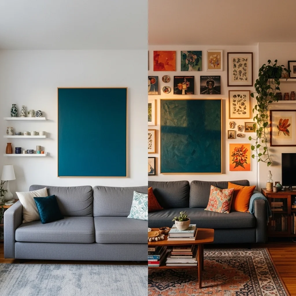
Furniture gives a room its bones. Paint gives it skin. But art gives it a personality. Without art or with art that’s been chosen carelessly even a beautifully furnished room can feel like a hotel lobby. Polished but impersonal. Comfortable but forgettable.
When art is chosen and placed thoughtfully, something shifts. A room starts to feel inhabited. It tells a story about the person who lives there. I once visited an apartment in Brooklyn where the furniture was cheap IKEA stuff, genuinely nothing impressive. But the walls were covered in a mix of original paintings, framed album covers, vintage botanical prints, and a few pieces the owner had made herself in a ceramics class. That apartment felt alive in a way that many far more expensive spaces simply don’t.
Art also does practical work. It draws the eye upward in rooms with low ceilings, creating a sense of height. It can anchor furniture groupings the way a rug does on the floor. It introduces color without the commitment of repainting. A single large abstract canvas in deep teal can do more for a neutral living room than months of searching for the perfect throw pillows.
Starting Point: Figure Out What You Actually Like

Before you think about placement, scale, or anything technical, you need a clear sense of your own visual preferences. Not what design blogs say is trending. Not what your more aesthetically confident friend would pick. What you actually respond to.
This sounds obvious, but most people haven’t done this work. They’ve absorbed a general sense of what “looks good” from Pinterest and Instagram, and they end up curating for an imaginary audience rather than for themselves.
A simple exercise: Spend a week saving images of rooms, art pieces, or even random photographs that you find visually appealing. Don’t overthink it. After a week, look at what you’ve collected and notice patterns. Are they mostly muted and earthy? Bold and graphic? Do you gravitate toward landscapes or abstract work? Figurative art or typography? You’ll find themes you didn’t consciously notice.
Also think about what you want a room to feel like. Calm and restorative? Energizing? Intellectual? Nostalgic? Different types of art produce different emotional atmospheres, and that’s not woo-woo interior design thinking it’s just how visual environments work on human psychology. A bedroom styled with soft watercolor botanicals feels fundamentally different from one with dramatic black-and-white photography, and both are valid choices, but they’re choices that should be made with intention.
Understanding Scale: The Most Common Mistake People Make
If I had to point to one thing that goes wrong most often when people hang art at home, it’s scale. Specifically, choosing pieces that are too small.
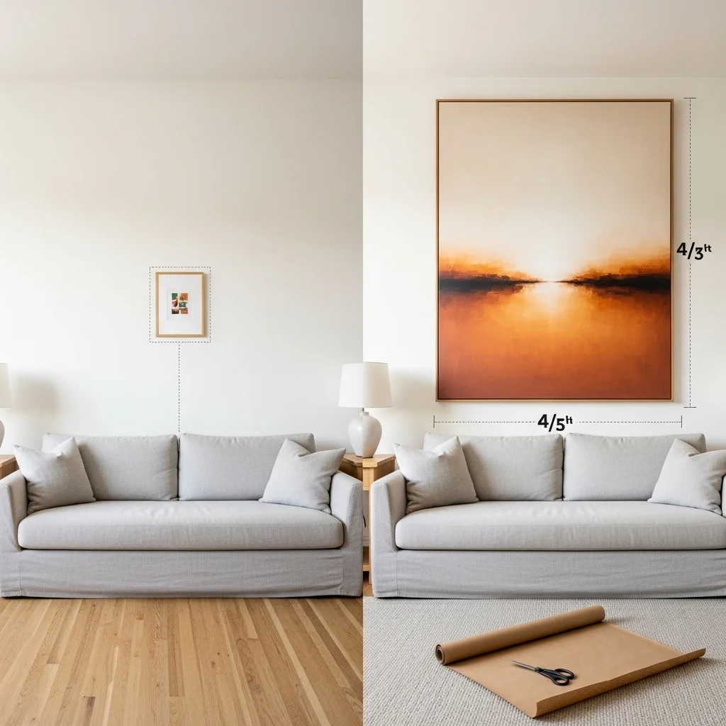
Walk through any home decor store and you’ll see the problem demonstrated perfectly: tiny 8×10 prints sold as “wall art,” meant to hang solo above a sofa or dresser, where they float like a postage stamp on an ocean of drywall. It happens everywhere, and it makes rooms feel uncertain like the decorator couldn’t quite commit.
A few rules of thumb on scale:
For artwork hanging above a sofa or large piece of furniture, the art should be roughly two-thirds to three-quarters the width of the furniture below it. If your sofa is six feet wide, you’re looking for a piece that’s somewhere around four to four and a half feet wide. That might mean one large canvas, or it might mean a group of pieces arranged together.
For large empty walls like the main wall in a living room or an expansive entryway don’t be afraid of oversized work. A canvas that measures 48×60 inches sounds enormous when you’re looking at it in a gallery or art store, but on a standard-height wall with furniture below it, it can look exactly right. When in doubt, cut out paper to your intended dimensions and tape it to the wall first. It sounds tedious, but it genuinely saves a lot of bad decisions.
In smaller spaces a bathroom, a hallway, a reading nook scale inverts. Here, thoughtful small works can be charming rather than lost, especially when grouped or when the wall space itself is narrow by design.
The Hanging Height Question
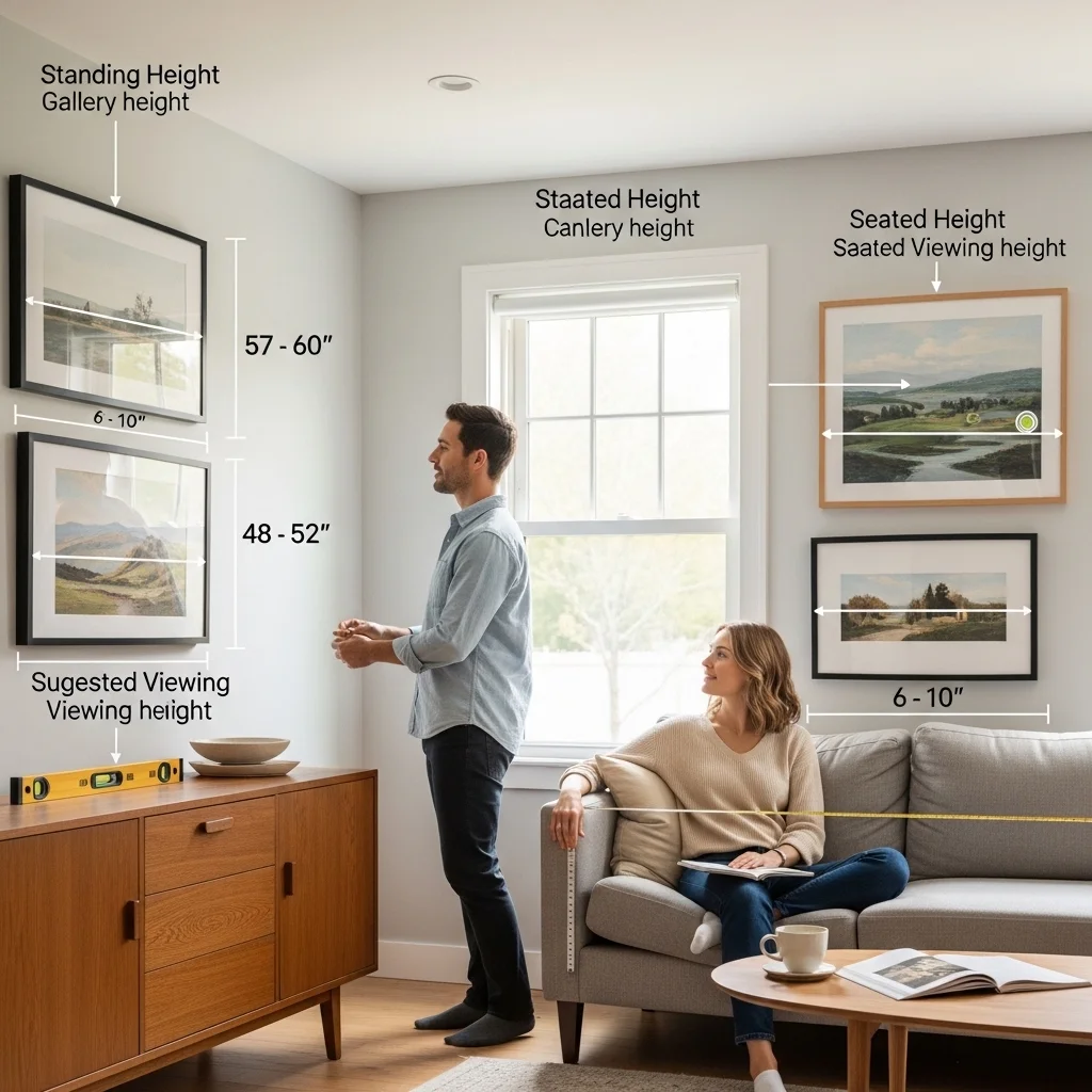
“Eye level” is the standard instruction for hanging art, and it’s a fine starting point. But let’s be more specific, because “eye level” means different things in different contexts.
The general guideline used by many galleries is to hang art so that the center of the piece is approximately 57 to 60 inches from the floor. This is an average human eye level when standing, and it works well for statement pieces in spaces where people mainly stand or move through hallways, dining rooms, entryways.
But in spaces where people are primarily seated living rooms, home offices, bedrooms you want to adjust downward. Hanging art at gallery height above a sofa where you’re always sitting means you’re never really looking at it straight on; you’re always looking up at it, which feels slightly off. Drop it down so the center is closer to 48 to 52 inches from the floor, and suddenly the art integrates into the seated experience of the room.
Above furniture, maintain a gap of about six to ten inches between the top of the furniture and the bottom of the frame. Much less than that, and the art looks like it’s sitting on top of the dresser or sideboard. Much more and it starts to float.
One more thing about hanging height that often gets overlooked: consistency across a room matters more than perfect individual placement. If you’re hanging multiple pieces in the same space, aligning their centers (or their tops, depending on the arrangement) creates visual coherence even when the pieces themselves are different sizes.
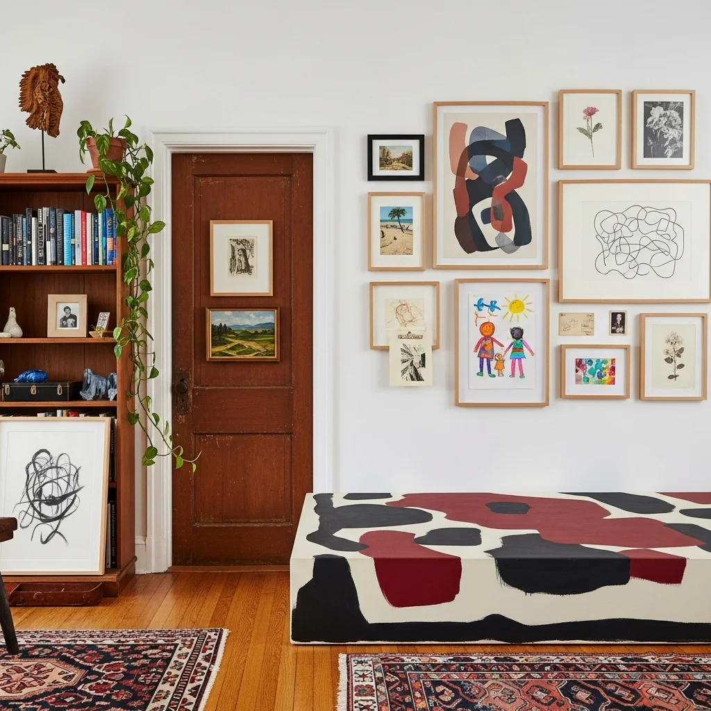
Gallery Walls: How to Do Them Without Making a Mess
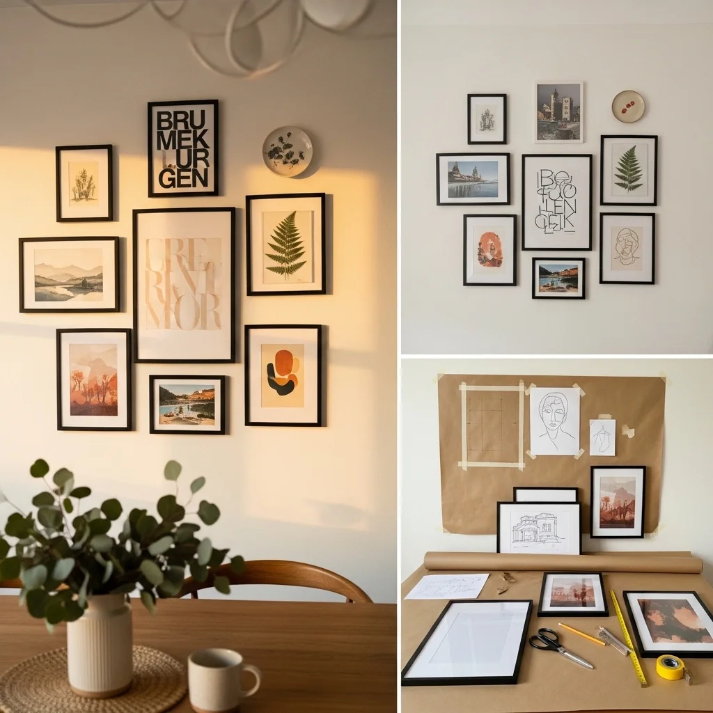
Gallery walls became enormously popular for a reason they’re a genuinely effective way to display a collection of work, and they can transform a staircase wall, a dining room, or a living room feature wall into something that feels curated and personal.
They also, when done poorly, look like a chaotic Pinterest experiment gone wrong.
The difference usually comes down to planning and a few key decisions about how the collection relates to itself.
Choose a unifying thread. This doesn’t mean everything has to match. It means there should be at least one thing that ties the pieces together: a consistent frame finish, a shared color palette, a common theme or subject matter, or a consistent style. Some of the most successful gallery walls I’ve seen mix very different types of work, a watercolor, a graphic print, a family photograph, a pressed fern, but everything is framed in the same black frames, and that creates enough visual order for the variety to feel intentional rather than chaotic.
Plan before you hang. The classic approach: trace each frame on kraft paper or newspaper, cut them out, tape them to the wall, and move them around until you like the arrangement. Takes maybe thirty minutes and saves a wall full of unnecessary holes. Alternatively, lay all your frames out on the floor first and arrange them there.
Start from the center and work outward. When hanging the actual pieces, begin with the most important or largest piece and build around it. This helps maintain balance and prevents the arrangement from drifting to one side.
Mind your gaps. Two to three inches between frames is a sweet spot. Closer than that and the arrangement starts to feel cramped; further apart and the pieces start to feel disconnected from each other.
Odd numbers tend to work better than even numbers for smaller groupings three, five, or seven pieces often feel more dynamic than pairs or sets of four. That said, large gallery walls with twelve or fifteen pieces don’t need to obey this rule as strictly.
Choosing Art for Specific Rooms
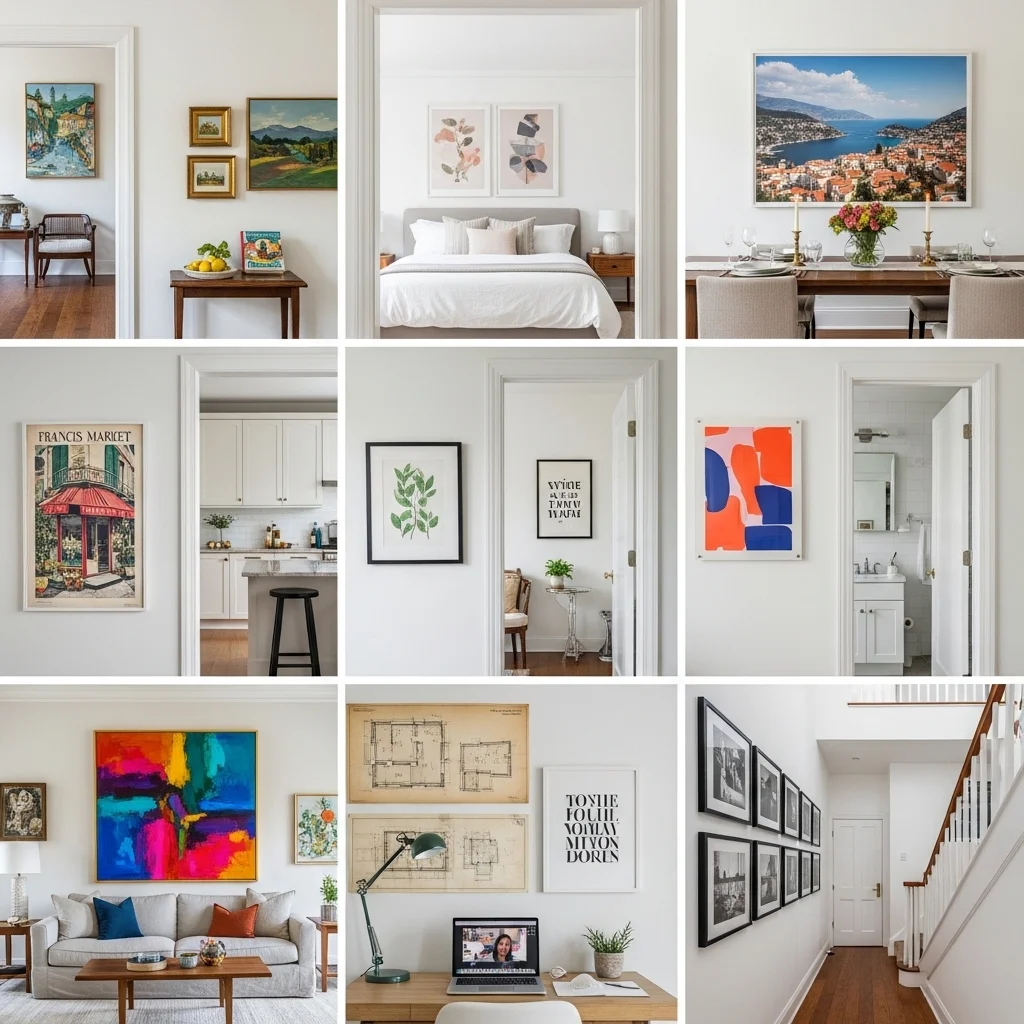
Different rooms have different functions, different lighting conditions, and different emotional registers. What works brilliantly in a dining room might feel wrong in a bedroom. Here’s a room-by-room breakdown.
Living Room
The living room is usually where you can take your biggest swings. This is the space most people spend time in and the space guests see first. It can handle bold color, large scale, and complex compositions.
The focal point is almost always the main wall often behind the sofa, but sometimes the fireplace wall or the wall facing the entry. This is where your anchor piece or your gallery wall should live. Go bigger than your instinct tells you to. A piece that feels slightly too large in the store often looks just right on the wall.
Don’t neglect the secondary walls. A well-placed medium piece on a side wall or in an alcove adds depth to the room and rewards people who actually spend time in the space.
Bedroom
The bedroom calls for a different approach. This is a restorative space, and the art you choose should support that quality. That doesn’t necessarily mean “calm” it means chosen with intention around how you want to feel when you wake up or wind down.
The primary placement is above the bed, which creates a headboard-like effect. The same rule applies: the art should be roughly two-thirds the width of the bed, and it should hang close enough to the headboard to feel connected to it rather than floating in the upper half of the wall.
Avoid hanging very large, busy, or visually intense work directly above where you sleep. Not because it will give you nightmares but because your eye tends to rest on whatever is in front of it, and something chaotic or demanding doesn’t serve that rest-oriented function. Save the more energetic or complex pieces for the wall you face when you enter the room, where they can create visual interest without hovering over you.
Kitchen and Dining Room
These are social spaces, and art here can be more playful, more unexpected. Food-related art has a long and sometimes terrible history, the ubiquitous “BREAD” and “WINE” signs of the early 2000s, but executed well, there’s nothing wrong with subject matter that relates to cooking, gathering, or abundance. Vintage culinary prints, market scenes, still lifes with fruit or flowers these can feel genuinely appropriate rather than forced.
In dining rooms, consider the experience from a seated position. A dramatic piece on the wall across from where guests sit becomes a focal point of the meal, so this is a great spot for something genuinely interesting something that sparks conversation.
Kitchens are often limited by wall space between cabinets and appliances, which makes them ideal for smaller works or narrow vertical pieces. Leaning a few small frames on a shelf or backsplash ledge is often easier than hanging in these spaces, and it gives you flexibility to swap things out.
Home Office or Study
This is where you can be more intellectually adventurous. Maps, typographic works, architectural drawings, complex abstract compositions pieces that reward sustained attention work well in spaces where you’re already in focused-attention mode. You’re looking at these works in long working sessions, so choose something you won’t tire of quickly.
Be careful about what’s visible in your background if you take video calls. This has become a genuine consideration that didn’t exist ten years ago. Art that feels personal and meaningful to you might read as odd or distracting on a work call. A clean, interesting piece that photographs well in the background is worth thinking about.
Bathroom
Often overlooked, bathrooms are actually great candidates for art particularly original pieces or prints that feel a bit unexpected in this context. Because bathrooms are small and you’re in them briefly, they’re good spaces for more intense colors or bolder graphic work. The key concern here is humidity, so be thoughtful about materials. Open paper prints without UV glass in a steamy bathroom will warp and yellow. Opt for well-sealed frames with UV-protective glass, or choose canvas work or photography printed on metal or acrylic, which handles humidity much better.
Hallways and Entryways
The entryway is the first impression of your home, and it’s worth investing some thought here. A single strong piece oversized, or a very deliberate small work in a specific spot can set the tone for the whole home. Hallways, because of their narrow, linear nature, work well with vertical pieces or a series of same-sized frames in a row.
Staircase walls are one of the most dynamic spots for a gallery wall, because they follow the natural diagonal of the stair and give you a large, extended surface to work with. Follow the same principles as any gallery wall, but account for the diagonal you’ll want to step up the arrangement gradually rather than clustering everything in the same horizontal plane.
Mixing Art Styles Without Creating Visual Chaos
One of the questions I hear most often is some version of: “Can I mix this abstract piece with the realistic landscape I already have?” Or “Can I mix black-and-white photography with color paintings?”
Generally, yes. With some thought.
The key is finding the connective tissue. As I mentioned with gallery walls, this might be a consistent frame style, a repeated color, or a shared mood or atmosphere. Two very different pieces a gestural abstract canvas and a detailed photorealistic botanical can coexist beautifully in the same room if they share some tonal quality or if they’re framed consistently.
What tends to look chaotic isn’t mixing styles; it’s mixing without any organizing principle. If you have five pieces that have nothing in common, different frames, wildly different color palettes, completely different scales and styles in the same room, the eye doesn’t know where to land, and the room feels restless.
A useful test: stand back from the space and squint your eyes slightly. If the room still reads as coherent, even blurry, you’re probably fine. If it looks like a jumble even at that level of visual reduction, something needs to go, or something needs to change.
Leaning vs. Hanging: When It Works and When It Doesn’t
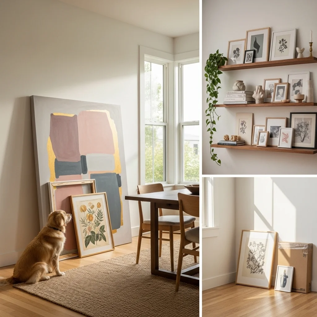
Leaning art resting it against a wall rather than hanging it has become genuinely popular in the last decade, and honestly it makes a lot of design sense when used correctly.
The main appeal is flexibility. You can rearrange things without holes in your wall, swap pieces easily, and layer works in front of each other for depth. A large canvas leaning against a dining room wall, with a smaller framed piece leaning in front of it, can look deliberately considered rather than lazy.
It works best with large-format pieces. A big canvas or oversized print leaning against a wall has visual weight and presence. A small 11×14 print leaning against a wall looks like you just got back from the frame shop and forgot to hang it.
Leaning also works on shelves floating shelves dedicated to art and objects, where small frames are leaned and layered with books, plants, and other objects. This approach is particularly forgiving for renters who want to minimize wall damage and for people who like to change things up frequently.
The safety consideration worth mentioning: if you have children or pets in the home, large leaning pieces need to be secured. A heavy canvas that tips onto a toddler is a genuine hazard. Picture-hanging safety hooks or museum putty on the bottom edges can keep things stable without permanent installation.
Working with What You Already Have
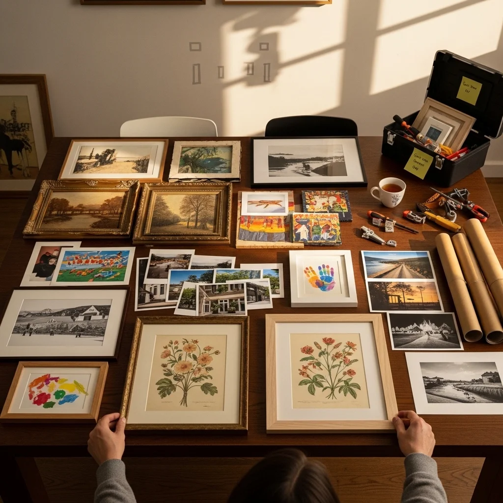
A lot of styling advice operates as though you’re starting from scratch, but most people aren’t. They have art they’ve accumulated over years gifts, impulse purchases, pieces they made, things inherited from family. The challenge is working with this existing collection rather than against it.
First, edit. Not everything deserves wall space. Some pieces are meaningful to you but genuinely don’t work visually in your current home. That’s okay. Put them in storage, in a closet, or in a lower-traffic room like a guest bedroom or laundry room. Not everything you own needs to be on display.
For the pieces you do want to display, look for the connections I mentioned earlier. Can they be grouped by color family? By subject matter? Are they all photographs? Even a diverse collection often has threads running through it that you can emphasize through arrangement.
Reframing is wildly underrated. A piece that looks dated or wrong in one frame can come completely alive in a different one. I once reframed an old print my grandmother gave me it had been in a heavy ornate gold frame that felt out of step with everything else I owned in a simple natural wood frame, and suddenly it looked exactly right in my living room. The print itself hadn’t changed at all.
Frame Choices Matter More Than People Think
Speaking of frames this is another area where choices have enormous visual impact but often get made without much thought.
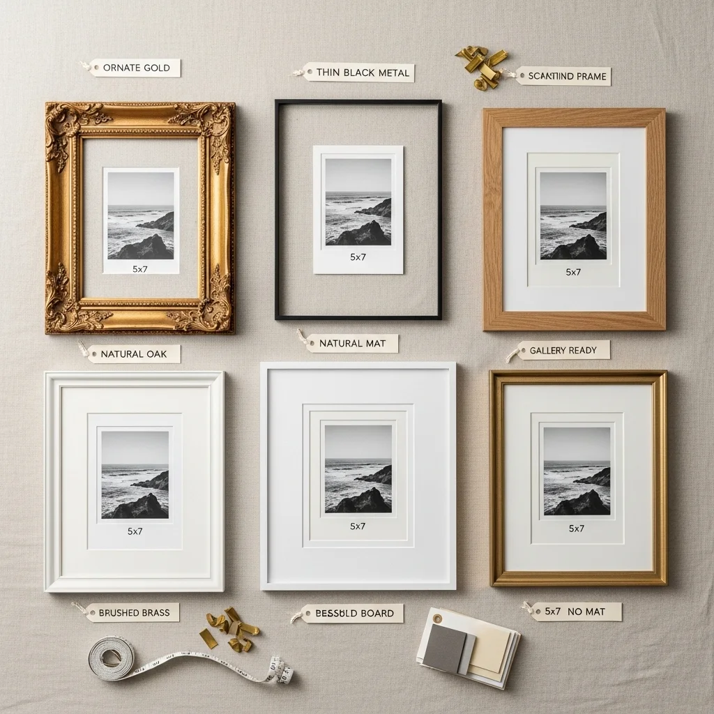
Heavy, ornate frames in gilded gold can be beautiful, but they’re specific and demanding. They work in rooms with traditional or maximalist aesthetics; in minimal, contemporary spaces they tend to look mismatched.
For contemporary homes, thin metal frames (black, gold, brass, silver) or simple wood frames (natural, white, or black) are versatile and tend to integrate without competing with the art itself. The point of a frame is to contain and protect the work and to mediate between the art and the wall it shouldn’t upstage either.
Consistency in frames doesn’t mean identical frames. It means frames that feel like they belong to the same visual family. If you’re mixing frame styles, try to stick to the same finish or the same visual weight.
Matting the space between the frame edge and the artwork adds formality and can make a small print feel more substantial. A 5×7 photograph in a 16×20 frame with a wide white mat looks considered and gallery-like. The same photo in a 5×7 frame feels casual and personal. Both are valid choices depending on the context.
Original Art vs. Prints: A Real Conversation
There’s sometimes a snobbery around this a suggestion that original art is inherently better or more legitimate than prints. I find this fairly tiresome, because the reality is more nuanced.
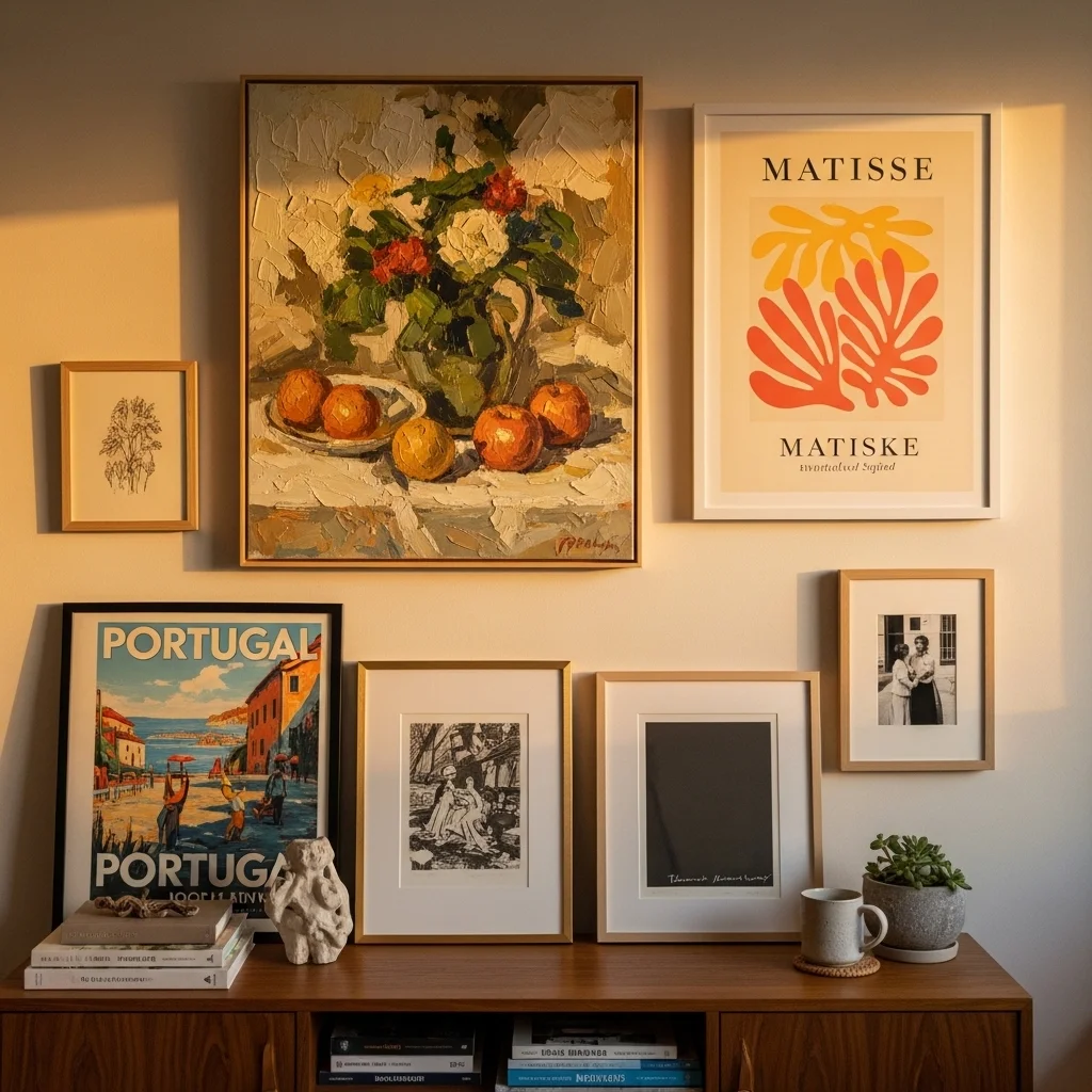
Prints whether art prints from a gallery, museum shop reproductions, or independently produced edition prints can be genuinely beautiful and can bring meaningful work into spaces where owning original art isn’t financially viable. A high-quality giclée print of a Matisse, a limited-edition print by a working artist, or a well-produced photograph all have real aesthetic value.
Original art paintings, drawings, photographs, and textiles bring something different: uniqueness, a more direct connection to a maker, and often a quality of texture and surface that reproduction can’t fully capture. There’s also something about living with original work that feels different in the long run. You made a choice to support a specific person, and the piece has a backstory that belongs to you.
My recommendation: don’t choose exclusively one or the other. Build a home that has both. Original pieces don’t have to be expensive local art fairs, open studio events, Etsy, and direct-from-artist platforms all offer accessible original work. A room that mixes an affordable original painting with a quality art print and a family photograph and a poster you picked up traveling is far more interesting than a room of exclusively purchased gallery art or a room of purely reproduced prints.
Color and Art: Making the Two Work Together
One of the trickier challenges is integrating art into a room that already has an established color palette.
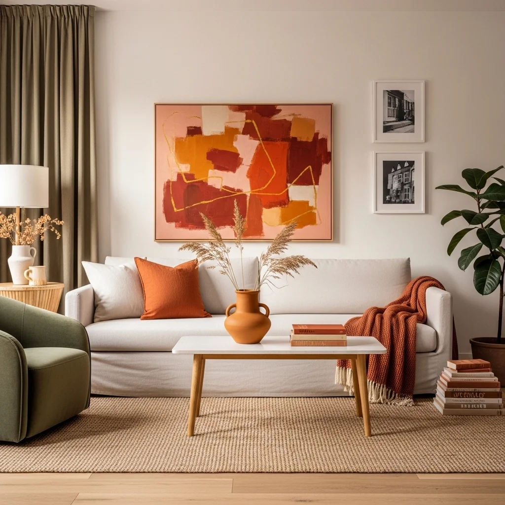
The conventional advice is to pull colors from the art when choosing furnishings, textiles, and accessories and this is genuinely good advice. If you have a painting with touches of burnt orange, echoing that in a throw pillow or a ceramic vase creates a sense that the room was designed holistically.
But the reverse also works: choosing art to complement an existing palette. If your living room is primarily cream and sage green, you might look for art that introduces warmth some terracotta, ochre, or warm gold without overwhelming what’s already there.
What tends to go wrong is contrast extremes. Art that’s wildly different in color from everything else in the room can work if it’s meant to be a bold focal point, but it needs to own that role completely large scale, prominent placement, strong enough presence to justify the visual disruption. A small piece in colors that clash with everything else in the room just looks like a mistake.
Neutral art black and white photography, graphite drawings, subtle monochromatic paintings is the great wild card. It goes with almost anything and can be especially useful in highly colorful rooms that need visual breathing room, or in very carefully curated rooms where you want the art to add texture without adding color.
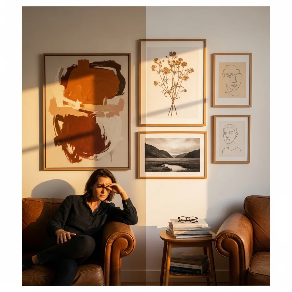
Art and Lighting: The Often-Neglected Partnership
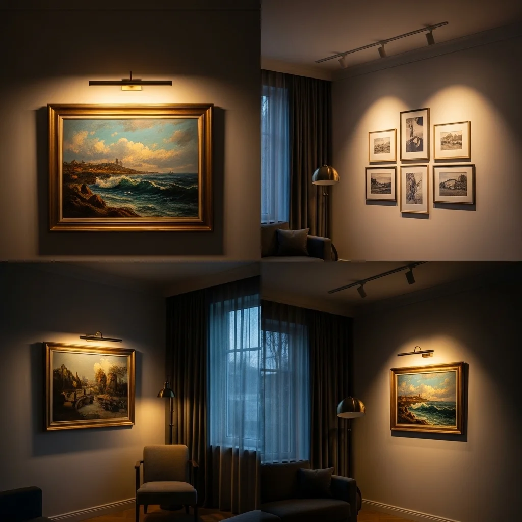
You can have the most beautiful piece of art in the world, and if it’s poorly lit, it’ll look flat and forgettable. Lighting is genuinely one of the most important factors in how art reads in a space.
Natural light is ideal, but it comes with caveats. Direct sunlight will eventually fade art particularly works on paper, certain pigments, and photography. UV-protective glass or positioning art away from direct sun is important for pieces you want to preserve.
For artificial lighting, picture lights, small fixtures mounted directly above or on the frame, provide focused illumination and look deliberate. These work especially well for statement pieces.
Track lighting or adjustable recessed lighting that can be aimed at artwork is probably the most flexible solution for multiple pieces. If you’re renovating or building, this is worth specifying; if you’re working with existing lighting, track systems can often be added to existing circuits without major work.
Even without dedicated art lighting, you can improve how art reads by ensuring it’s not in a dark corner. Positioning art near existing light sources, or adding a lamp nearby, makes a real difference.
Wall washers lighting fixtures designed to spread light evenly across a wall surface are particularly effective for gallery walls, illuminating multiple pieces at once with relatively even coverage.
When to Break the Rules
I’ve given you a lot of rules in this article. Some of them are worth following carefully. Others are just useful starting points that can be abandoned when you have a good reason.
Hanging art unusually low almost at floor level, leaning toward the baseboard can create a striking, unconventional effect in certain spaces. Some of the most memorable art moments in homes I’ve visited have involved giant canvases hung dramatically low, nearly touching the floor, which creates this sense of the art almost being a piece of furniture.
Hanging art on unexpected surfaces inside a bookcase, on the back of a door, on a small wall beside a window can be charming and surprising. It rewards people who actually look.
Mixing very personal items with “proper” art, framed children’s drawings, and vacation snapshots in the same frame style as fine art prints. This handwritten letter means something, humanizes a space in a way that a room full of carefully chosen gallery work sometimes doesn’t. The homes that feel most alive are usually the ones where the art tells you something true about the people who live there.
And ultimately, that’s the most important thing. Art in your home isn’t about demonstrating taste for other people. It’s about surrounding yourself with things that mean something to you, that you find genuinely beautiful or interesting or moving, and that make the specific rooms you spend your days in feel like yours.
Practical Toolkit: What You Actually Need to Hang Art Well

A few things that make the physical process easier:
A stud finder is essential for hanging anything heavy. Frame on drywall anchors is fine for light pieces; anything substantial needs to hit a stud or use quality wall anchors rated for the weight.
A level even a small bubble level or a level app on your phone, saves you from the chronic slight-angle problem that makes rooms look sloppy.
A measuring tape is obvious, but have one in the room where you’re working, not somewhere on the other side of the house.
Painters tape for mocking up arrangements on the wall before committing.
Two-point hanging hardware on heavier pieces, two hooks across the top rather than a single central wire, prevents the piece from shifting and tilting over time.
Museum putty or earthquake wax on the bottom corners of frames prevents tilting and works as a safety measure for lighter pieces in homes with kids or pets.
A Final Thought
The most stylish homes I’ve ever spent time in, the ones that genuinely linger in memory, aren’t the ones with the most expensive art or the most perfectly executed gallery walls. They’re the ones where it’s obvious that someone actually loved the things on their walls. Where you can see the personality of a real person in the choices, the imperfections, the mix of old and new, cheap and precious, acquired and inherited.
Good art styling isn’t about achieving a magazine spread. It’s about building an environment that feels genuinely yours, one that you actually want to come home to, that you still notice after years of living with it, that has room to grow and change as you do.
Start somewhere. Hang the piece you love even if you’re not certain about the placement. Edit and adjust over time. Live with things before you decide they’re wrong. And trust that a home that reflects who you actually are will always be more interesting than one that reflects who you think you’re supposed to be.