I’ll never forget the couple who called me in a panic after painting their master bedroom a vibrant coral-orange. “We thought it would be energizing and happy,” they explained, “but we can’t fall asleep anymore.” They weren’t wrong about the energy part. Their bedroom now felt like a permanent sunrise, which is wonderful at 7 AM but torturous at 11 PM when your brain refuses to power down.
That experience, early in my interior design career, drove home something I’d read about but hadn’t fully witnessed: bedroom colors profoundly affect our ability to relax and sleep. Since then, I’ve helped dozens of clients transform their bedrooms from stimulating spaces into genuine sanctuaries, and I’ve learned that choosing the right color is equal parts science, personal preference, and practical consideration.
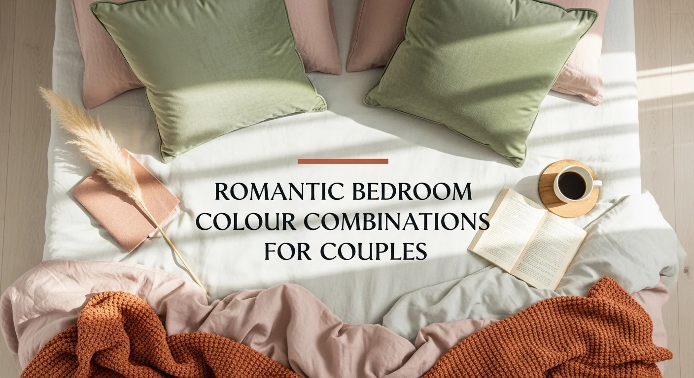
Why Bedroom Color Actually Matters More Than You Think
Before we dive into specific colors, let’s talk about why this matters at all. You might think, “It’s just paint on walls, how much difference can it really make?” The answer: quite a lot, though perhaps not in the mystical way some decorating blogs suggest.
Color affects us on multiple levels. There’s the physiological response certain wavelengths of light genuinely do influence our nervous systems. Blues and greens, for instance, are associated with lower heart rates and reduced blood pressure in several studies. Then there’s the psychological component, which is more complex and personal. Your associations with colors are shaped by culture, memory, and individual experience.
I had a client who initially resisted my suggestion of soft blue for her bedroom because her childhood room had been an institutional-looking light blue she hated. Fair enough. We ended up with a gorgeous sage green instead, which gave her the same calming benefits without triggering negative memories. This is why rigid color “rules” only get you so far.
The Psychology Behind Relaxing Colors (Without the Pseudoscience)
Let’s separate what we actually know from what’s marketing hype.
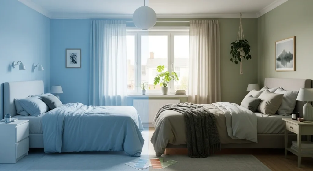
Cool colors generally relax us more than warm ones. This isn’t absolute there are exceptions but there’s reasonable evidence that blues, greens, and lavenders tend to have a calming effect on most people. A study conducted by Travelodge surveyed 2,000 homes and found that people with blue bedrooms got an average of 7 hours and 52 minutes of sleep per night, the most of any color surveyed.
Now, I’m not suggesting that painting your walls blue will magically grant you better sleep if you’re scrolling Instagram until 2 AM. But when all other factors are equal, cooler colors seem to support relaxation better than their warmer counterparts.
Saturation and brightness matter as much as hue. A bright, saturated blue can be just as stimulating as orange think about how alert you feel looking at a brilliant summer sky. For bedrooms, you generally want lower saturation (more muted, grayed-out tones) and moderate to low brightness. This is why “dusty” versions of colors work so beautifully in bedrooms.
Context and personal association override general principles. If you grew up spending summers at your grandmother’s sea-green cottage where you felt completely at peace, then sea-green might be perfect for your bedroom, even if it’s not the most popular choice. Honor your own experiences.
The Best Colors for Bedroom Relaxation (With Important Nuances)
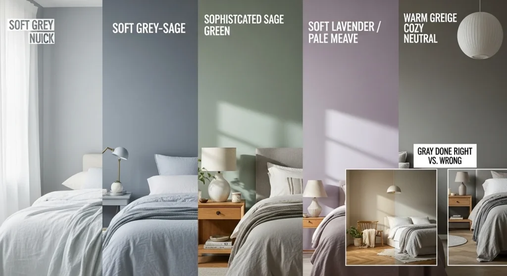
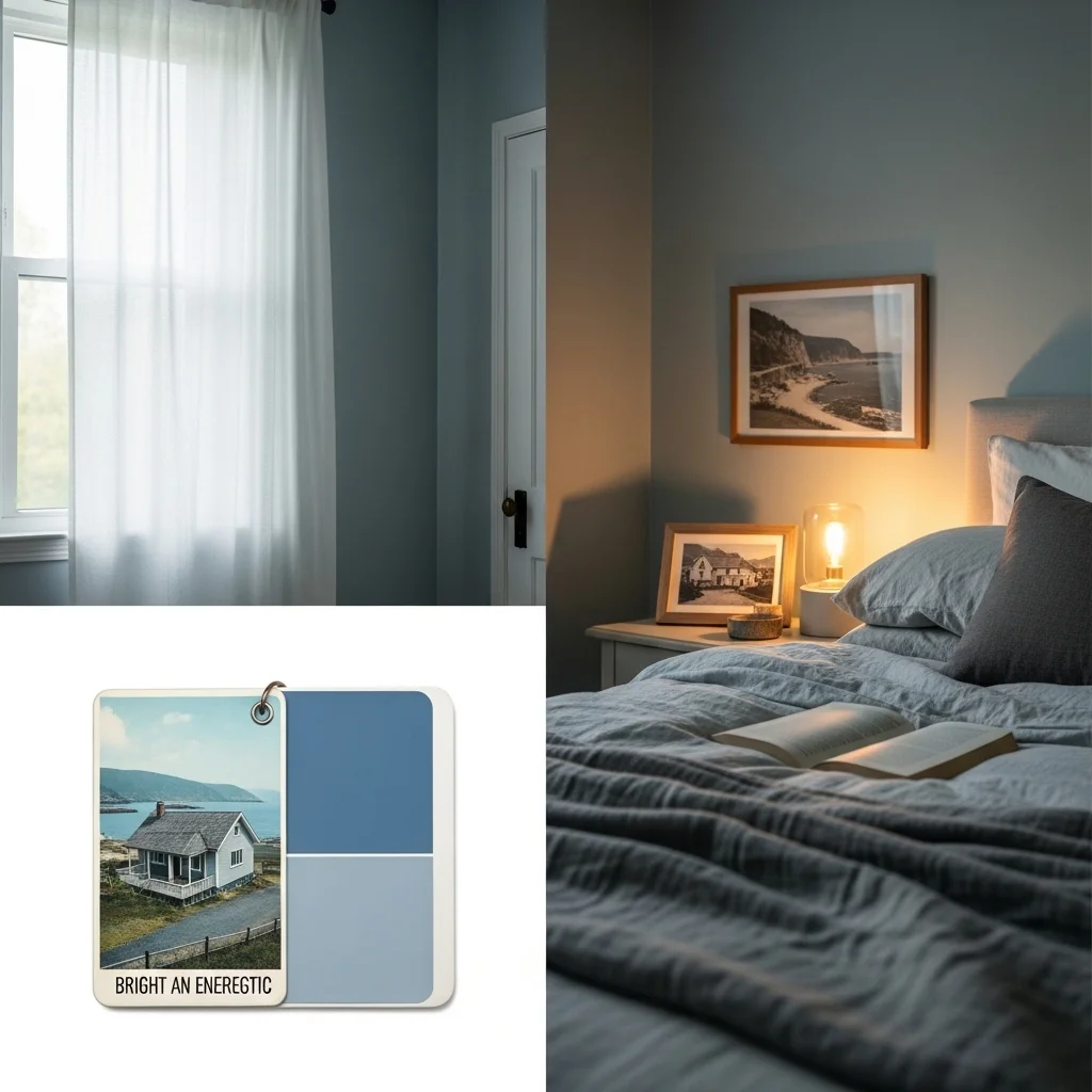
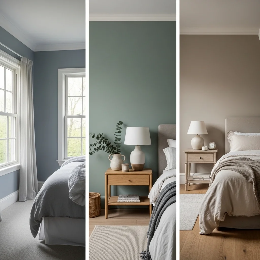
Soft Blues: The Reliable Classic
There’s a reason blue is consistently recommended for bedrooms it works. But “blue” encompasses everything from navy to powder to gray-blue, and the distinctions matter enormously.
I tend to steer clients toward blues with gray undertones rather than bright, clear blues. Colors like “Silver Strand” (a popular gray-blue) or “Quiet Moments” (a barely-there blue) create that sense of calm without feeling cold or stark. The key is testing them in your actual bedroom lighting, which I’ll get to later.
One caveat: if your bedroom doesn’t get much natural light, very pale blues can sometimes read as stark or even slightly depressing. In those cases, I might suggest a blue-gray with slightly more depth, or consider a different color family altogether.
Greens: Nature’s Tranquilizer
Greens are underutilized in bedrooms, and I’m not sure why. Perhaps people associate them with kitchens or bathrooms. But a sophisticated sage, moss, or eucalyptus green can be incredibly soothing.
There’s something inherently restful about green probably because we evolved surrounded by vegetation, and our nervous systems recognize it as a “safe” color. I’ve noticed that people with high-stress jobs often respond particularly well to green bedrooms. Something about that connection to nature seems to help them decompress.
The trick with green is avoiding shades that are too yellow-green (which can feel acidic and energizing) or too blue-green (which can sometimes feel clinical). Look for greens with gray mixed in, which gives them sophistication and softness.
Soft Lavenders and Mauves: The Unexpected Soothers
Purple has a mixed reputation, but in its softest, most muted forms, it can be genuinely lovely for bedrooms. I’m not talking about bright violet or royal purple those are far too stimulating. I mean the barely-purple shades that almost read as gray with just a whisper of lavender.
These colors work particularly well in bedrooms that get good morning light, as they take on a beautiful, soft glow. They also pair wonderfully with both warm metals (like brass) and cool metals (like nickel), giving you flexibility in your fixtures and accessories.
One client, a busy surgeon, chose a pale mauve for her bedroom and reported that it was the first color that made her feel like she could “turn off” when she got home. The softness felt nurturing without being overly feminine or childish.
Warm Neutrals: When Done Right
Not everyone wants a cool-toned bedroom, and that’s completely fine. Warm neutrals, beiges, taupes, warm grays, soft creams can absolutely work for relaxation, but they require more finesse.
The danger with warm neutrals is that they can either feel too bland (in which case the room lacks the personality to feel like a true retreat) or too warm (which can be subtly stimulating). The sweet spot is warm neutrals that have enough character to feel cozy but aren’t so saturated that they activate you.
I worked with a couple who both ran cold and found cool colors made their bedroom feel unwelcoming despite being technically “relaxing.” We went with a greige (gray-beige hybrid) called “Accessible Beige” that had warm undertones but wasn’t too yellow. They paired it with soft white bedding and natural wood furniture, and the result was a bedroom that felt like a cozy hug calm but not cold.
Grays: Proceed with Caution
Gray is everywhere right now, and it can work beautifully in bedrooms. But gray is also tricky, and I’ve seen it go wrong often enough to warrant a warning.
The problem is that gray can read very differently depending on lighting and undertones. A gray that looks perfect in the store or online might turn purple, blue, or even green on your walls. Additionally, too much gray without contrast or warmth can feel institutional and depressing.
If you love gray, go for it but test extensively (more on this below), and plan to add warmth through textiles, wood tones, and lighting. A gray bedroom with warm oak floors, cream bedding, and soft lighting can be serene and sophisticated. The same gray with all-white everything and harsh overhead lighting will feel like a holding cell.
Colors to Approach Carefully (or Avoid Entirely)
Bright Reds and Oranges
Remember that coral-orange bedroom from my opening story? Energizing, warm colors have their place in homes, but the bedroom usually isn’t it. Red increases heart rate and blood pressure literally the opposite of what you want before sleep.
That said, I won’t say never. If you absolutely love warm colors, consider using them as accents rather than wall colors. A burnt orange throw pillow or terracotta pot won’t sabotage your sleep the way four walls of bright red will.
Pure White
This might be controversial, but I generally don’t recommend pure white for bedroom walls, despite how popular it is on Instagram. Pure white can feel stark and institutional, especially with overhead lighting. It also tends to highlight imperfections and can be visually harsh.
If you love the clean, airy feeling of white, consider warm whites, soft creams, or the palest possible versions of other colors (barely-there blue, almost-white green). These give you that light, open feeling without the sterility.
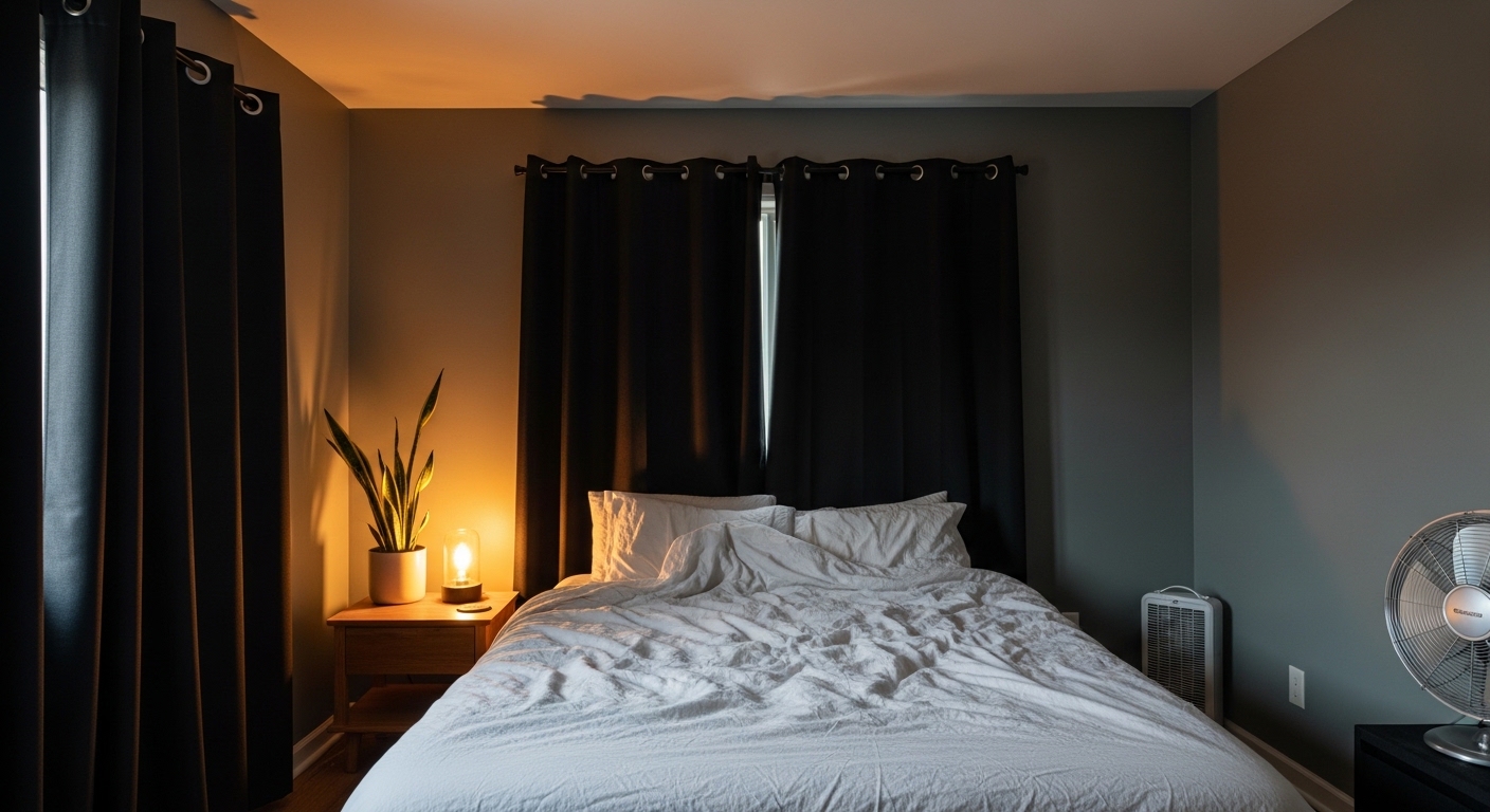
Very Dark Colors
Deep navy, charcoal, black these have become trendy for “moody” bedrooms, and they can look stunning in photographs. In real life? They’re much trickier to live with.
Dark colors absorb light, making rooms feel smaller and potentially cave-like. For some people, that’s cozy. For others, it’s claustrophobic. Dark colors also show dust, scuffs, and imperfections more readily, and they require very intentional lighting to avoid feeling oppressive.
I’m not saying don’t do it, but be honest with yourself about your personality and needs. If you’re someone who gets SAD (Seasonal Affective Disorder) or feels down in darker spaces, a moody charcoal bedroom probably isn’t your best bet, no matter how good it looks on Pinterest.
Beyond Color: Critical Factors That Influence Your Choice
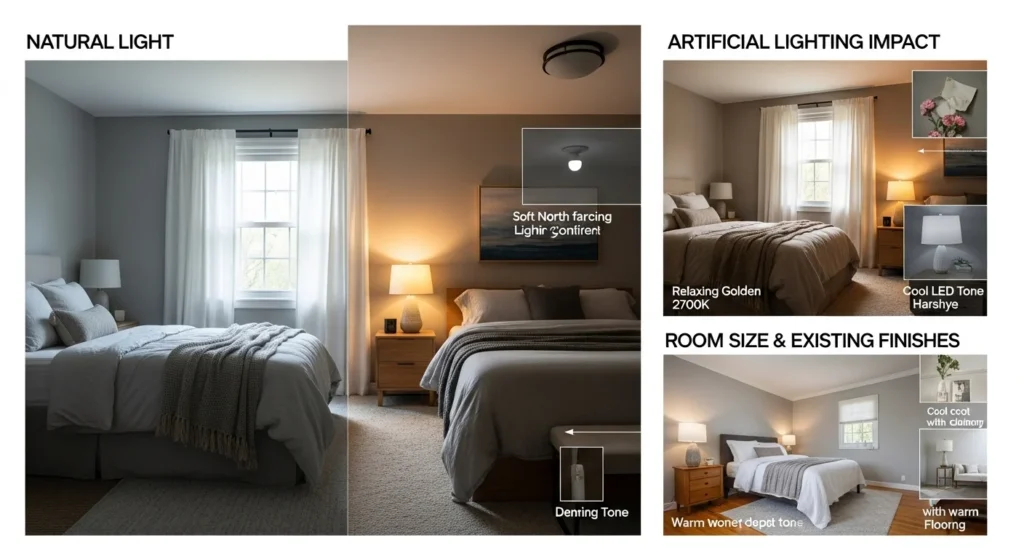
Natural Light: The Great Modifier
I cannot overstate how much natural light affects color perception. A color that looks gorgeous in a sun-drenched southern-facing room might look completely different in a north-facing room that gets softer, cooler light.
Rooms with lots of morning light can handle cooler colors beautifully, as the warm sunrise balances them out. Rooms with afternoon light might benefit from cooler colors to offset the warmth. North-facing rooms with limited direct sunlight often need warmer shades to avoid feeling cold.
Before choosing any color, observe your bedroom at different times of day. Notice where the light comes from, how it changes, and how it interacts with your current wall color. This observation period is more valuable than any color theory.
Artificial Lighting: The Underestimated Factor
I once consulted on a bedroom that looked beautiful during the day but turned an odd, sickly shade under the existing light fixtures. The homeowner had installed cool LED bulbs in their ceiling fixture, which clashed with the warm undertones in their paint choice.
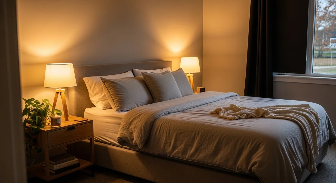
Your lighting both the fixtures and the bulbs dramatically affects how color appears. Warm bulbs (2700K-3000K) make colors appear more yellow/golden. Cool bulbs (4000K+) make colors appear bluer and crisper. For bedrooms, I almost always recommend warm bulbs, as they’re more conducive to relaxation.
Also consider the type of lighting: overhead fixtures, bedside lamps, accent lighting. Ideally, you want layered lighting with dimmer switches, so you can adjust the ambiance for different activities (reading, getting dressed, winding down for sleep).
Room Size and Ceiling Height
Darker or more saturated colors make rooms feel smaller and cozier. Lighter colors make rooms feel larger and more open. This isn’t good or bad it’s just a tool to achieve your desired effect.
If you have a large bedroom that feels impersonal, a medium-toned color can make it feel more intimate. If you have a small bedroom that feels cramped, lighter colors will help it feel more spacious.
Ceiling height matters too. Standard 8-foot ceilings benefit from lighter colors that don’t emphasize the lower height. Higher ceilings can handle richer colors without feeling closed in.
Existing Furniture and Flooring
Unless you’re starting from scratch, you’ll need to work with what you have. Take an honest inventory of your furniture finish, flooring color, and any built-ins or features you can’t change.
If you have warm honey-oak floors (like many homes), very cool wall colors can create a clashing effect. You’ll either need to add a rug to bridge the gap or choose wall colors with some warmth. Similarly, if you have dark furniture, very dark walls might create too much heaviness.
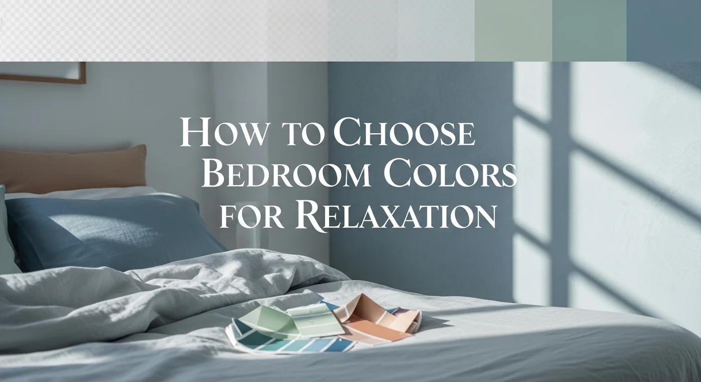
Testing Colors the Right Way (Because Paint Samples Lie)
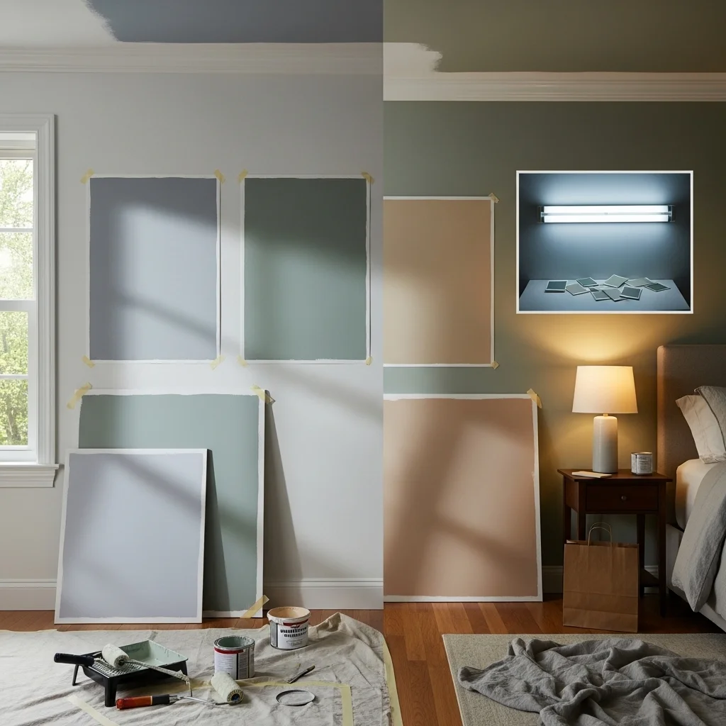
Here’s what not to do: look at tiny paint chips under fluorescent store lighting and make a decision. Those little chips are nearly useless.
Here’s what actually works:
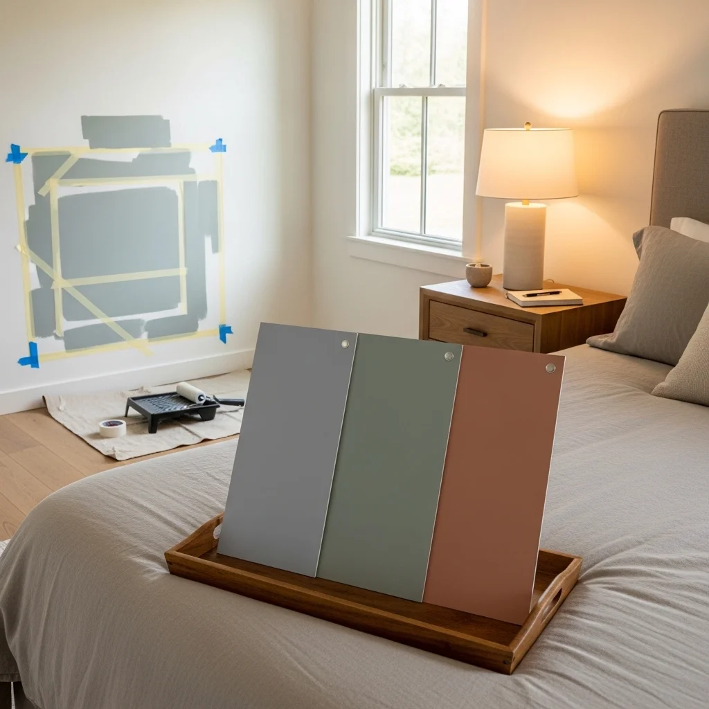
Get large samples. Most paint stores sell small sample sizes. Buy at least two or three options and paint large poster boards or sample squares directly on your wall at least 2 feet by 2 feet.
Place them properly. Put samples on different walls to see how light affects them. Include a section that gets direct light and a section that’s more shadowed.
Observe at different times. Look at your samples in morning light, afternoon light, evening light, and artificial nighttime lighting. Colors change dramatically throughout the day.
Live with them for at least a week. I know this seems excessive, but you’d be surprised how differently you might feel about a color after seeing it every day for several days. That soft blue that seemed perfect on day one might start feeling too cool by day five.
Consider the ceiling and trim too. Most people test wall colors but forget that the ceiling color and trim color dramatically affect the overall feeling. A stark white ceiling with a warm wall color creates a different effect than a ceiling painted in a lighter version of the wall color.
Personal Preference: The Variable That Trumps Everything
I’ve given you a lot of guidance based on color theory and my professional experience, but here’s the truth: your personal response to color matters more than any general principle.
Some people genuinely feel more relaxed surrounded by warm colors, even though cool colors are typically recommended. Others find that a bold color makes them happier, and happiness leads to better relaxation than following the “rules” ever would.
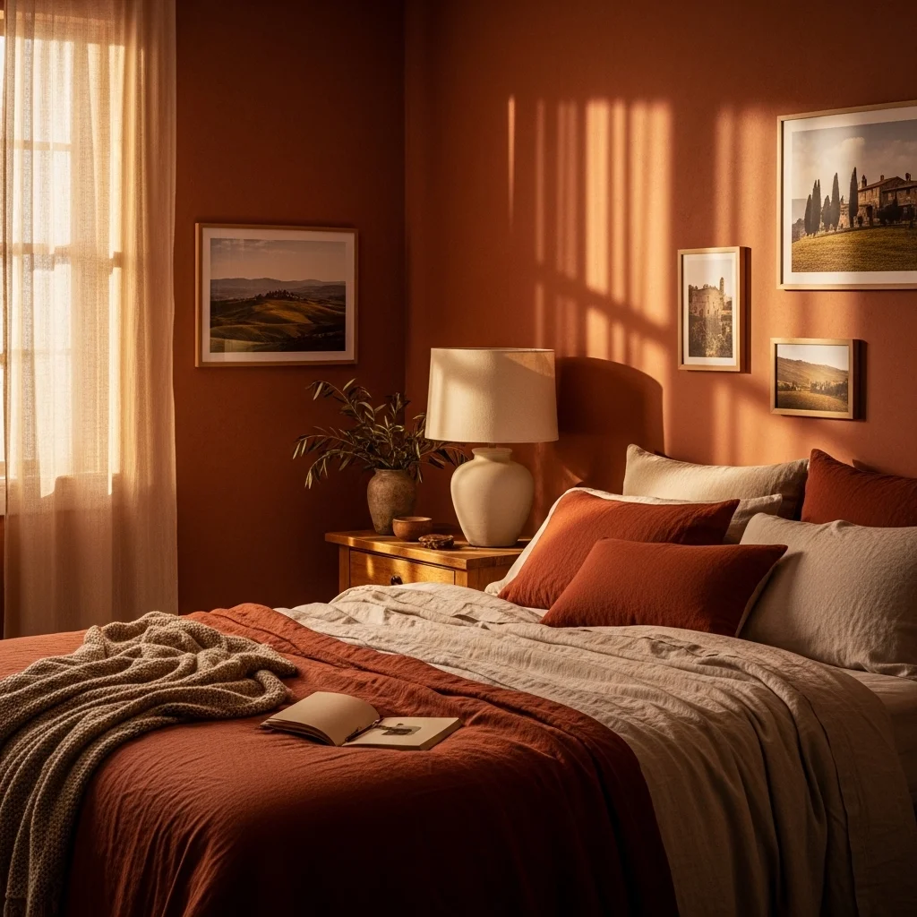
I had a client who, against all conventional wisdom, painted her bedroom a medium terracotta. On paper, this shouldn’t work for sleep. But she’d spent a transformative year in Tuscany, and that color reminded her of the happiest, most peaceful time in her life. She reported sleeping better than she had in years.
The lesson? Use guidelines as a starting point, but trust your gut. If you consistently feel drawn to a color that “shouldn’t” work, there might be a good reason.
Common Mistakes I See Repeatedly
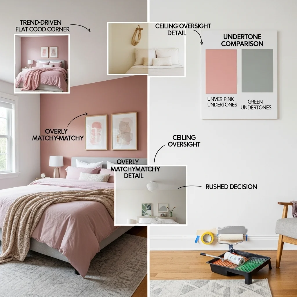
Choosing a color because it’s trendy. Millennials’ pink, various shades of gray, sage green every few years there’s a new “it” color. Trends are fun, but you have to sleep in this room every night. Choose what actually soothes you, not what’s popular this season.
Going too matchy-matchy. Everything doesn’t need to coordinate perfectly. In fact, bedrooms often feel more relaxing with some variety and texture. Don’t stress if your wall color doesn’t exactly match your duvet.
Ignoring the ceiling. The ceiling is a huge expanse of color that affects the overall mood. At minimum, make sure your ceiling color works with your wall color. Sometimes painting the ceiling the same color as the walls (or a lighter version) creates a cozy, enveloping feeling.
Forgetting about undertones. This is huge. Two colors might both be labeled “gray” or “beige,” but one has pink undertones while the other has green undertones. Undertones become very obvious once the paint is on your walls, and they can make or break the look.
Rushing the decision. I get it you want your bedroom done. But living with a color you hate is worse than living with primer for an extra week while you test properly.
Bringing It All Together: A Practical Approach
If you’re feeling overwhelmed, here’s a simple process to follow:
Start with how you want to feel. Not what color you think you should use, but how you want the room to feel. Peaceful? Cozy? Serene? Restful? This emotional target guides everything else.
Consider your constraints. Note your lighting, room size, existing furniture, and flooring. These factors eliminate some options and highlight others.
Narrow to three possibilities. Based on general principles (cool colors tend to relax, etc.) and your personal preferences, choose three colors to test. Include a safe option, a slightly bolder option, and maybe a wild card.
Test thoroughly. Get samples, paint large swatches, observe for at least a week.
Make the call and commit. Eventually, you have to choose. None of your options will be perfect, because no color is perfect. That’s okay. Choose the one that feels best and move forward.
Remember that paint is changeable. If you truly hate it after living with it for a month, you can repaint. It’s inconvenient and costs money, but it’s not permanent. This perspective takes some pressure off the decision.
My Personal Take: The Colors I Return to Again and Again
After years of working with clients and experimenting in my own home, I keep coming back to a few color palettes that consistently work for bedroom relaxation.
Gray-blues with warm white trim. Something like Benjamin Moore’s “Gray Owl” or Sherwin Williams’ “Rainwashed” colors that read as soft, sophisticated blue-gray. These work in almost any lighting, pair with most furniture, and genuinely seem to help people relax.
Soft sages and eucalyptus greens. Colors like “Clary Sage” or “Retreat” muted greens that feel organic and calming without being too yellow or too blue.
Warm, complex neutrals. Sophisticated greiges and taupes like “Revere Pewter” or “Edgecomb Gray” that have enough warmth to feel welcoming but enough gray to feel current and calm.
Notice that none of these are bold or saturated. For bedrooms specifically spaces dedicated to rest I tend to favor subtle, complex colors over anything too simple or strong. There’s a reason we call them “restful” colors.
A Final Word on Perfection
Here’s something that might surprise you: I’ve seen bedrooms in “wrong” colors where people sleep beautifully, and bedrooms in “perfect” colors where people struggle. Color is one factor in relaxation, but it’s not the only one.
Your bedroom’s ability to support relaxation also depends on clutter levels, mattress quality, screen time habits, room temperature, noise levels, and about a hundred other variables. Getting the color right is valuable, but it’s not magic.
Choose thoughtfully, test properly, and trust yourself. Your bedroom should feel like a retreat that’s uniquely yours not a generic hotel room or a copy of someone’s Instagram. The “right” color is the one that makes you feel at peace when you walk in, helps you transition from the day’s stress, and supports the kind of rest you need.
That might be a classic soft blue, or it might be that terracotta that reminds you of Tuscany. Only you can know which one truly serves you.